Advanced Typography - Final Project
Teoh Hoong Boon (Julius) | 0338478
Advanced Typography
Final Project
Lecture Notes
Week 11
This week we had two presentations for lectures as the past week was a holiday.
The first was one done by my team, a presentation about the perception and organization of typography and explores the ways of type arrangement, Gestalt psychology, and hierarchy.
Below were the slides presented:
Following that was a presentation on the different mediums for typography and explores the uses of typography in interactive unorthodox ways.
Below were the slide presented:
Instructions
Week 9
We were informed of the final project and advised to think about a topic or problem of which we could solve typography wise.
Week 10
Week 10
-public holiday-
Week 11
In this week's class, we were to share our plans and rationale for our final projects. My topic revolves around a local annual celebration that is based off a celebration in Japan, the Bon Odori festival. Malaysia has been celebrating this festival for a while now as a way of appreciating the Japanese culture. My goal is to create a typeface that can be utilised in the promotional material. More specifically, a font that can allow the English translation of the word "Bon Odori" sit next the original Japanese writing, "盆踊り" and not look out of place or as a separate style. The festival is all about celebrating the union of cultures after all.
Below is the slides containing the related information and rationale:
Below is the slides containing the related information and rationale:
Fig 1.1 - Proposal Slides
After getting the green light from Mr Vinod. I proceeded to gather reference of Japanese texts to aid in the type creation. Mr Vinod also suggested that I refer to a font called Baloo which as an Indian style take on the dual linguist text style.
Fig 1.2 - Mood Board
I then proceeded to make some sketches to try and incorporate the feel of Japanese text into roman letters. Initially I looked for strokes from existing Japanese characters that can be altered to match the look of roman letters.
Fig 1.3 - Sketches
After showing Mr Vinod my sketches, he simply told me to proceed to doing digital execution if I already have a feel to go with. I transferred a photo of my sketch into Illustrator and proceeded to outline and refine the letters.
Fig 1.4 - Screenshot Digital Execution
Fig 1.5 - Initial Letters
After settling what seemed a decent visual, I then proceeded to do some collaterals to showcase the utilisation of the font. Initially I had planned to apply the text to an existing poster of the event from the previous year but decided to also try making a standalone version using a free stock photo from Unsplash.
Fig 1.6 - Image by taken from Unsplash
Fig 1.7 - Screenshot of Work Space
Week 13
I showed my adaptations to Mr Vinod and Mr Shamsul. Mr Vinod said that the words were not refined enough and told me to make the letters more clean rather than decorative. Mr Shamsul advised me to maintain consistency with the characteristics of the Japanese fonts I am using.
Fig 1.8 - Imitation Poster Adaptation
Fig 1.9 - Improvised Poster
I worked on making the letters more recognisable and also more consistent with the Japanese words. Minimising the curvature and having it follow a grid.
Fig 1.10 - Screenshot of Work Space Progress
Fig 1.11 - Finalised Headline
Fig 1.12 - PDF File of Finalised Headline
Fig 1.13 - Finalised Poster Design
Fig 1.14 - PDF File of Finalised Poster
Feedback
Week 11
General Feedback: Keep in mind the reason or problem that motivates one to do the project that we do. Working backwards from an existing artwork is less effective.
Specific Feedback: My idea of creating a dual linguist title font is acceptable. I should refer to existing fonts such as Baloo to observe how others have adapted English text to fit with another language.
Week 12
Specific Feedback: Mr Vinod advises that since I have the direction, I can proceed to doing the visual in digital form in favour of time.
Week 12
Specific Feedback: Mr Vinod advises that since I have the direction, I can proceed to doing the visual in digital form in favour of time.
Week 13
Specific Feedback: Pay attention to the type style that the proposed font will be next to, it should have similar style and stroke. The font also needs be more refined as it feels very messy at the moment.
Reflection
Experience
Week 11
We were to propose our plan and rationale for the project. Mine pertains to creating a dual linguist font for a local festival that celebrates Japanese culture.
Week 12
With idea approved, work began on visualising the letters for the headline and refining it for a collateral.
Week 13
The words needed more work to make it look more refined. Apparently what I had was still considered "early phase".
Observation
Week 11
I observed that dual linguist text is a type of typeface that has characteristics from another language, allowing it to make standard text sit together with foreign ones.
Week 12
Observation this week is that referring to the script to make a new font involves more than just re-purposing curves and strokes.
Week 13
I observed that just because a font has character, it can still be considered incomplete or unrefined by some.
Findings
Week 11
I find myself unsure of my ideas anymore.
Week 12
I find the process of coming up with visuals to be full of uncertainties.
Week 13
I find that sometimes characteristics need to be sacrificed for the sake of being recognisable.
Further Reading
Week 11
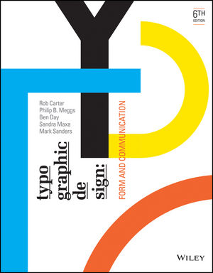
Typographic Design: Form and Communication by Rob Carter, Ben Day and Philip Meggs
A pretty straightforward book that explains the typography basics behind things like visual hierarchy and grids. Pretty insightful if to act as a reminder on some of the rules, do's and don'ts.
Week 12
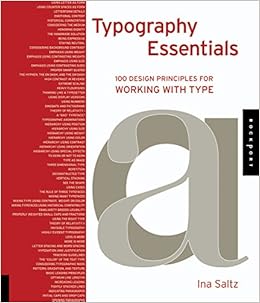
Typography Essentials: 100 Design Principles for Working with Type by Ina Saltz
The book does exactly what it says on the cover, give an insight into the principles of working with type. It acts as a guide to crafting with letter forms and mastering how to use it effectively.
Week 13
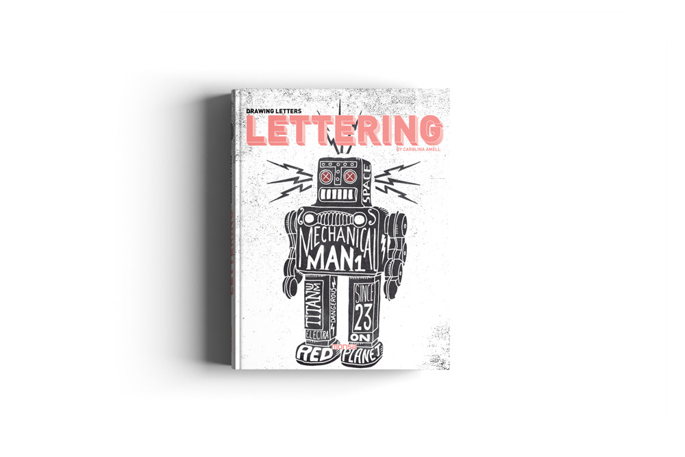
Lettering by Carolina Amell
The first impressions of this book was that it was a guide on how to make letters for me. Turns out its more of a compilation of works from other artist and their rationales. It allows a peak into the mind of the artist who created the artwork.


Comments
Post a Comment