Advanced Typography - Project 1

Week 6 - Week 9
Teoh Hoong Boon (Julius) | 0338478
Advanced Typography
Project 1: The Troublemakers Manifesto: A Design Colloquium
Lecture Notes
Week 7
This week another group lead the lecture with another presentation. This time about designing type. The lesson consisted on the anatomy of text, the treatment of text, as well as the classification of font type.
Below is the presented slides:
Instructions
Week 6
This week we were briefed on Project 1 of the module. Titled "The Troublemakers Manifesto: A Design Colloquium", we were to design collaterals for the seminar/design conference. Our first task is to design a key artwork that will be utilised through all the collaterals.
Initially we were told that images both photograph and illustrative could be used, so long as we adhere to the theme. For my initial idea, I wanted to go with an illustrative style featuring a take on graffiti.
It all begins with a photo that I had of a friend from some time before.

Fig 1.1 - Initial Photo
I then worked to crop out the picture and making adjustments. Due to the happy-go-lucky look on the model's face, I chose to obscure it with an hand drawn face mask and glasses to imitate the look of a delinquent.

Fig 1.2 - Cropped Photo

Fig 1.3 - Cropped photo with colour adjustment
With that done, I then proceeded to illustrate over the model and adding colour and details to mimic graffiti and paint. However, it felt a little lacklustre partly due to the colours not really standing out in CMYK color space.

Fig 1.4 - Adjusted photo with illustration
With that done, I then proceeded to illustrate over the model and adding colour and details to mimic graffiti and paint. However, it felt a little lacklustre partly due to the colours not really standing out in CMYK color space.
Week 7
Since Mr Vinod and Mr Shamsul agreed that the key artwork could use more work and also reminded me that the type needs to be integrated into the key artwork.
I decided to play around with the text, making it illustrated alongside the photo. Adopting an Eastern Japanese influence to the design, the key artwork featured an emblem like feel with the words "Troublemaker" drawn in a cloud motif and a vague illustration of a dragon. There was also supposed to be an imagery of an Oni, a Japanese demon, in the background but feeling that it made the key visual a little crowded I decided to leave it out.

Fig 1.5 - Readjusted photo with rough sketch

Fig 1.6 - Refined Image in program

Fig 1.7 - Refined Image
Week 8
However, due to being absent from class because of an illness, I unfortunately could not consult on this visual until the week after.
Sadly, I would recover from my illness only to be met with despair as my visual was rejected due to not fitting with the theme. Frantically, I tried to find an alternate visual while maintaining the letters. I tried to stick with the dragon visual by using an actual photo of a dragon. I tried to do a sort of graffiti vandalism feel with it.

Fig 1.8 - Image by taken from Unsplash

Fig 1.9 - Grayscale Image with illustrated graffiti

Fig 1.10 - Integrated Key artwork
Alas, this too would be rejected as it again did not fit the feel. Partly because the dragon apparently looked more like a gargoyle, but also because the letters did not fit the feel of the image.
With the clock ticking down and agitation in my heart, I resorted to one last imagery that had a resonance with the word "Troublemaker". The brief said "Troublemakers often make others feel uncomfortable", and this last ditched effort would embody that. For the imagery I would finally settle on would be that of the middle finger.

1.11 - Image by taken from Unsplash
The reason being that the middle finger is practically synonymous with invoking discomfort in a person as the very sight of it can set off anyone. But this was just part of the picture. Firstly, the image would be flipped to show a left hand. The reason being that in some cultures, using the left hand to do things was seen as impolite and for troublemakers, impolite is practically part of the fun. The left handedness also ties back to the creative field as those who are left handed are thought to be more creative. Atop the image would also be drawn a hand doing the piece sign while holding a stylus pen. This plays multiple roles, to obscure the initial photo to make the image more striking when noticed, to represent a desire for peace, and the finally the stylus pen to represent affinity with design.

Fig 1.12 - Cropped Image

Fig 1.13 - Cropped Image with illustrated lines and words.

Fig 1.14 - Completed Key visual
Fig 1.15 - PDF file of Key Visual
Feedback
Week 6
For the Project, the key artwork can be made from a illustrated image, be it vector or handdrawn. However, caution should be taken to ensure the style of the illustration matches the mood or the theme of the event the visual is promoting.
Week 7
Generalize the key visual so that it may be more understandable by a large audience, also consider the mood of the subject matter. Also apply type interplay to the design
Week 8
-Absent-
Week 9
Mr Vinod suggested to make the key visual more approachable to a wider audience rather than confining it to a specific style. The main words for the masthead need to be connected. Try to choose just one element.
Reflection
Experience
Week 6
This week I got to plan for the key visual for a design seminar. Not too dissimilar to the second exercise.
Week 7
Had to reconsider the treatment of the key visual and take the text integration into consideration this week.
Week 8
This week I had to continue on my own as I was not able to attend class. Carrying on with making the new key visual and text integration on my own was interesting.
Week 9
Observation
Week 6
While editing the original photo, I observed that the expression or feel of the original image affects the edited copy and that sometimes some changes such as obscuring the face is necessary in order to make it fit the theme of the visual.
Week 7
This week the observation is that text integration needs to be done alongside the visual manipulation when doing text visual interplay.
Week 8
This week I observed that illustrating text gives it a unique feel but also a unique application.
Week 9
I observed this week that sometimes one needs to be a bit daring with their choice of visuals if it matches the intended design.
Findings
Week 6
I find the exercises done prior to this assignment could have been tied together better.
Week 7
I find that working with text is infinitely more frustrating when one incorporates it later.
Week 8
I find that text integration into a illustration is not easy as text have a somewhat rigid structure that needs to be worked into a flow of an illustration.
Week 6
An A-Z of Type Designers by Neil Macmillan

This book explores the processes of designing letters and typefaces as well as exploring these processes in the context of digital environment. The author includes also gives insights to some of his own techniques to be effective.
Week 8
Type Team: Perfect Typeface Combinations by Tony Seddon
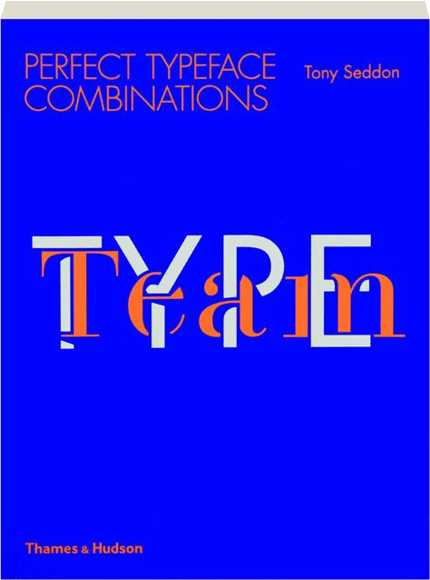
A book meant to act as a guide to combining typefaces. It explores the ways of combining typefaces so as to convey emotions and messages effectively without looking disorganised or haphazard.
Reflection
Experience
Week 6
This week I got to plan for the key visual for a design seminar. Not too dissimilar to the second exercise.
Week 7
Had to reconsider the treatment of the key visual and take the text integration into consideration this week.
Week 8
This week I had to continue on my own as I was not able to attend class. Carrying on with making the new key visual and text integration on my own was interesting.
Week 9
Had to revise the key visual again this week. Tried to reuse the illustrated text with another visual but ended up completely revising and remaking the visual altogether.
Observation
Week 6
While editing the original photo, I observed that the expression or feel of the original image affects the edited copy and that sometimes some changes such as obscuring the face is necessary in order to make it fit the theme of the visual.
Week 7
This week the observation is that text integration needs to be done alongside the visual manipulation when doing text visual interplay.
Week 8
This week I observed that illustrating text gives it a unique feel but also a unique application.
Week 9
I observed this week that sometimes one needs to be a bit daring with their choice of visuals if it matches the intended design.
Findings
Week 6
I find the exercises done prior to this assignment could have been tied together better.
Week 7
I find that working with text is infinitely more frustrating when one incorporates it later.
Week 8
I find that text integration into a illustration is not easy as text have a somewhat rigid structure that needs to be worked into a flow of an illustration.
Week 9
I find that there will be unique interpretations on culture despite the fact that the culture is established.
Further Reading
Week 6
An A-Z of Type Designers by Neil Macmillan
This book explores the processes of designing letters and typefaces as well as exploring these processes in the context of digital environment. The author includes also gives insights to some of his own techniques to be effective.
Week 8
Type Team: Perfect Typeface Combinations by Tony Seddon
A book meant to act as a guide to combining typefaces. It explores the ways of combining typefaces so as to convey emotions and messages effectively without looking disorganised or haphazard.


Comments
Post a Comment